Sovereign was a high-stakes strategic repositioning project for a leading state-owned investment enterprise. The goal was to modernize their decade-old visual identity and communication framework to align with global market standards while firmly rooting the brand in its regional heritage.
Problem Statement
The client faced a "perception gap." While they managed billions in assets, their brand image felt outdated and lacked the visual authority required to engage with elite global partners.
Solution Provided
Strategic Audit: Analyzing regional and global competitors to find a unique "white space" for the brand.
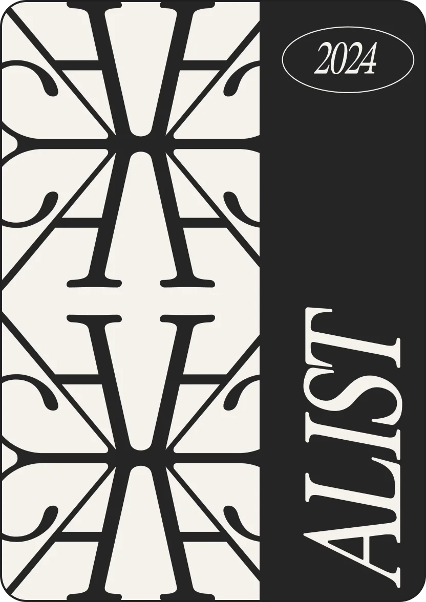
Visual Authority Design: Developing a minimalist, bespoke identity system including a custom typeface and a refined color palette (Obsidian & Sand Gold).
Narrative Framework: Crafting a new core story centered around "Legacy and Innovation."
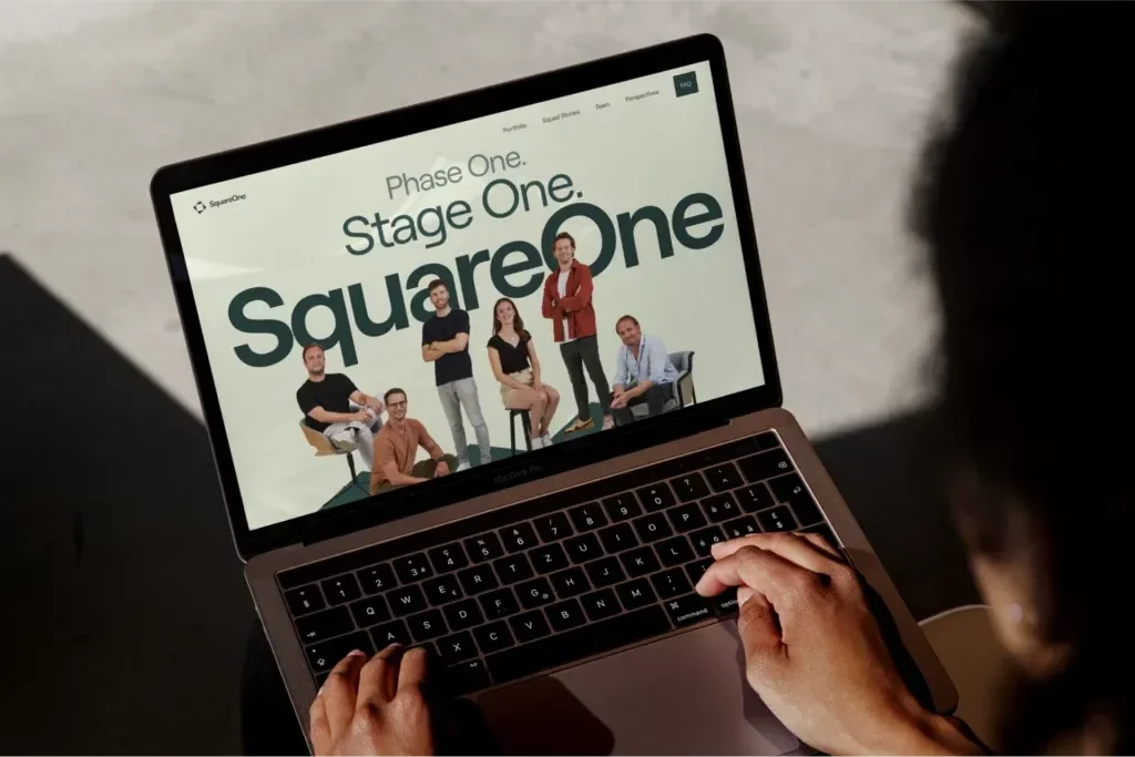
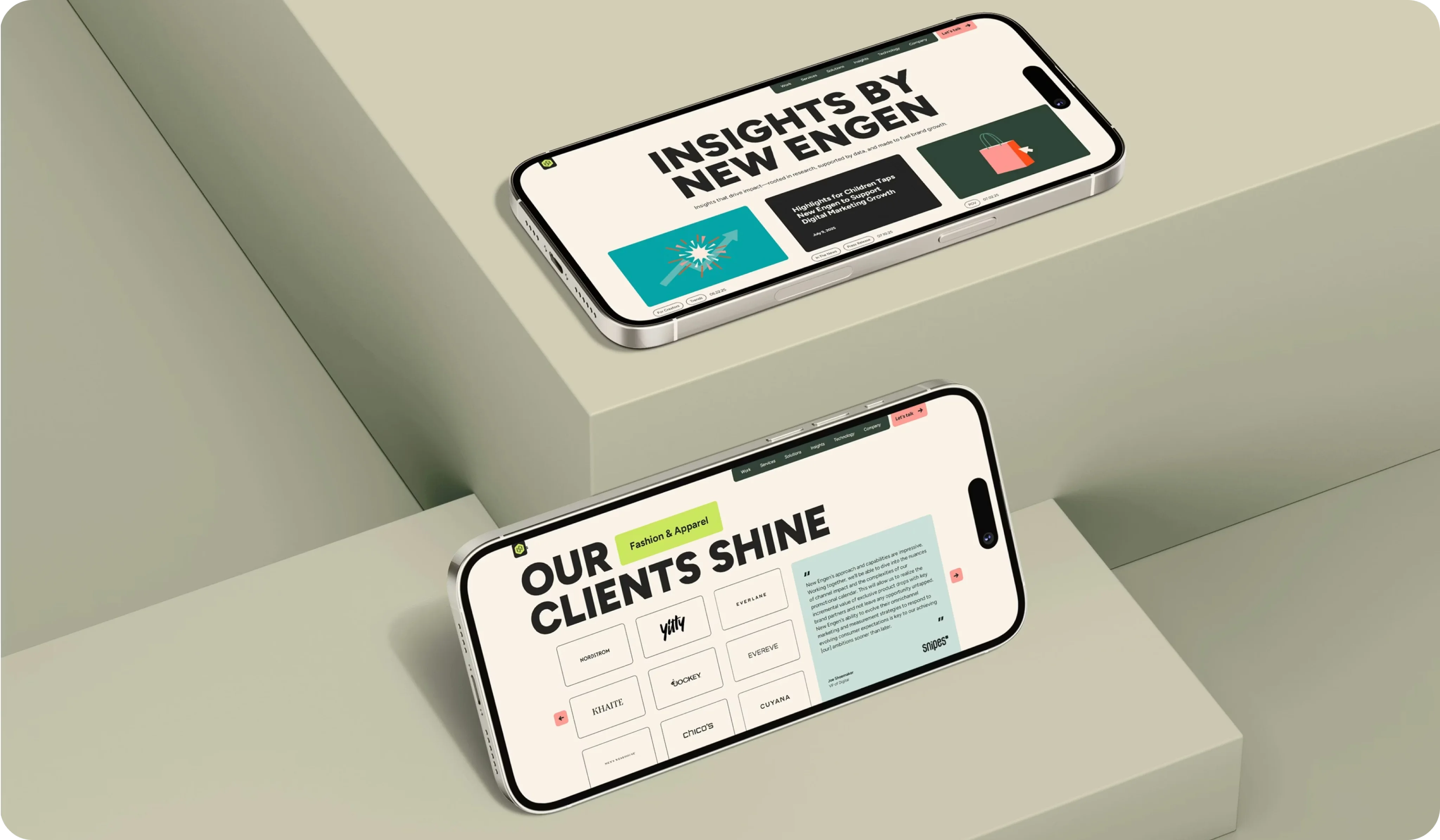
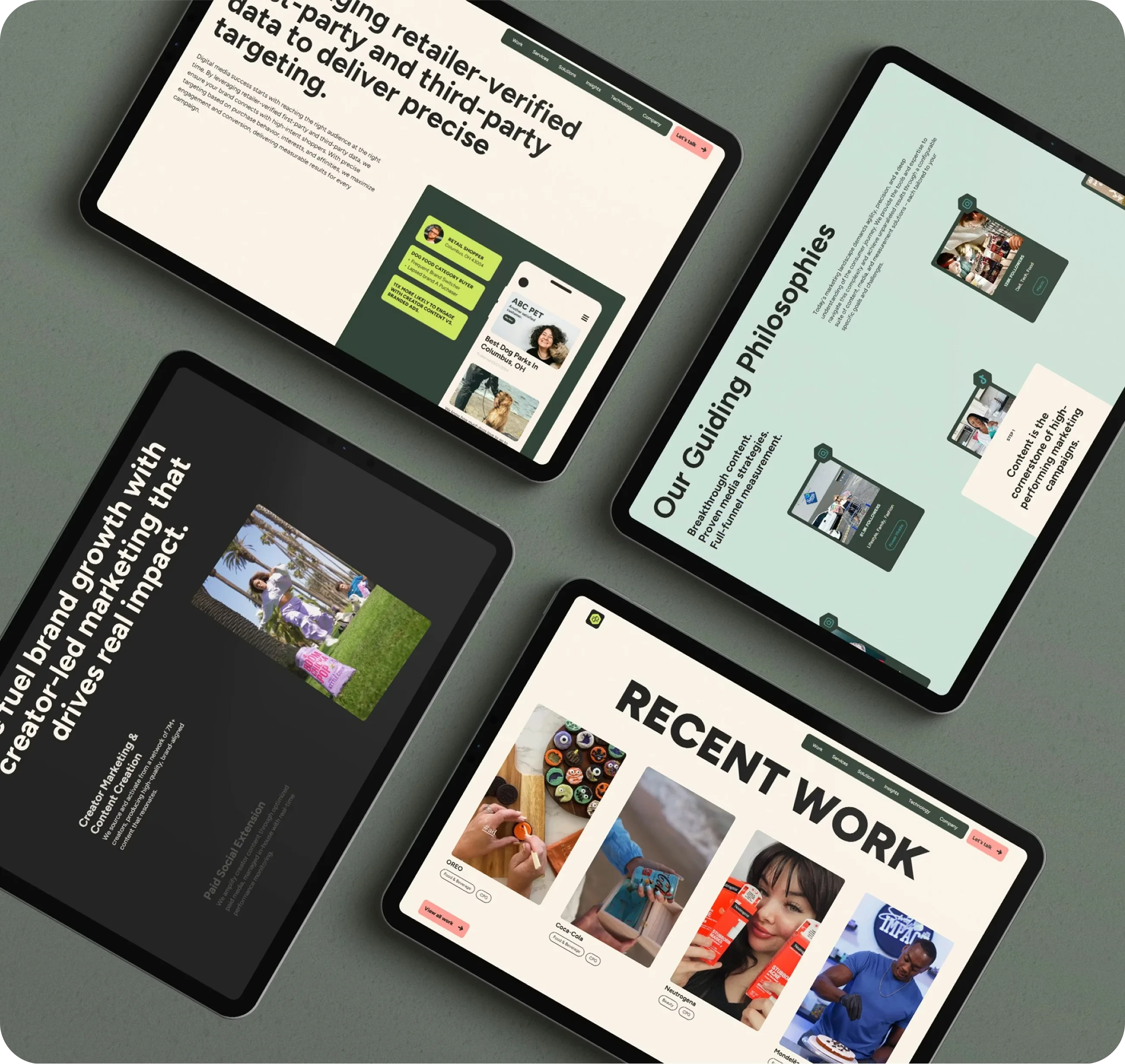
Digital Ecosystem: Designing a high-end, read-only dashboard for stakeholders to monitor impact with absolute clarity.

Outcomes
Market Perception: 40% increase in brand sentiment among international institutional investors within the first 6 months.
Engagement: A 200% rise in digital inquiries from high-level strategic partners.
Consistency: Unified the brand across 12 different subsidiaries under one cohesive visual and strategic umbrella.
Legacy: Successfully launched the new identity at a major regional summit, receiving praise for its cultural resonance.